Case Study | Product Design
SAVii
Financial wellness, built into the workplace, salary-linked lending for employees across the Philippines.
Role
Lead Product Designer
Timeline
2026
Team
3
Industry
B2B2C Fintech
Platform
App Store/Play Store

01 Overview
Lending that meets people where they earn.
SAVii is a salary-linked lending platform in the Philippines. Employees borrow against income they've already earned, and repayments come directly out of payroll, which makes it structurally different from consumer lending apps. There's no credit application in the usual sense, no interest-rate shopping, and no chasing repayment. The employer is part of the loop.
That changes the design problem. Users aren't comparing products. They're usually people who need money before payday and want to know one thing quickly: how much can I get, and what will it cost me?
My role: Design lead and primary client contact. I owned design direction across the product, ran the client relationship with SAVii's product team, and mentored an Associate Product Designer on the account.
02 The Brief vs The Real Problem
The brief was a solution. We went looking for the problem.
Almost every request arrived as a solution. Redesign this screen. Change this copy. Add this field. Rarely as a problem.
The loan offer page was the clearest example. We were asked to redesign it. Nobody said why.
So we asked. Repeatedly, and not always comfortably, pulling the actual problem out of a client takes more questions than anyone enjoys answering, and there's a real cost to that. It slows things down. It can read as resistance rather than diligence.
Eventually the data came out: users were dropping off on the loan offer page at a significant rate. They couldn't work out how to adjust the loan amount. They couldn't see their monthly repayment. They couldn't see the total they'd end up paying. The screen was showing everything and communicating nothing.
That's a fundamentally different brief. "Redesign this page" produces a nicer page. "Users can't understand what they're agreeing to" produces a different product.
The trade-off: persistent questioning creates friction with a client who wants execution. We accepted that friction. A redesign built on the stated brief would have shipped faster and changed nothing.

03 The resistance
Three decisions we had to argue for
The app had been in market four years. Some of what it needed wasn't subtle, it was overdue. But "the market moved on" isn't an argument a client has to accept, so each of these had to be made properly.
Restructure 01
Loan Offer Page
Asked for: A visual redesign.
Actual problem: Users couldn't understand the offer, or change it.
The real design question wasn't visual. It was hierarchy: what belongs on the screen immediately, what belongs one tap away in a bottom sheet, and what can be collapsed entirely.
What we decided:
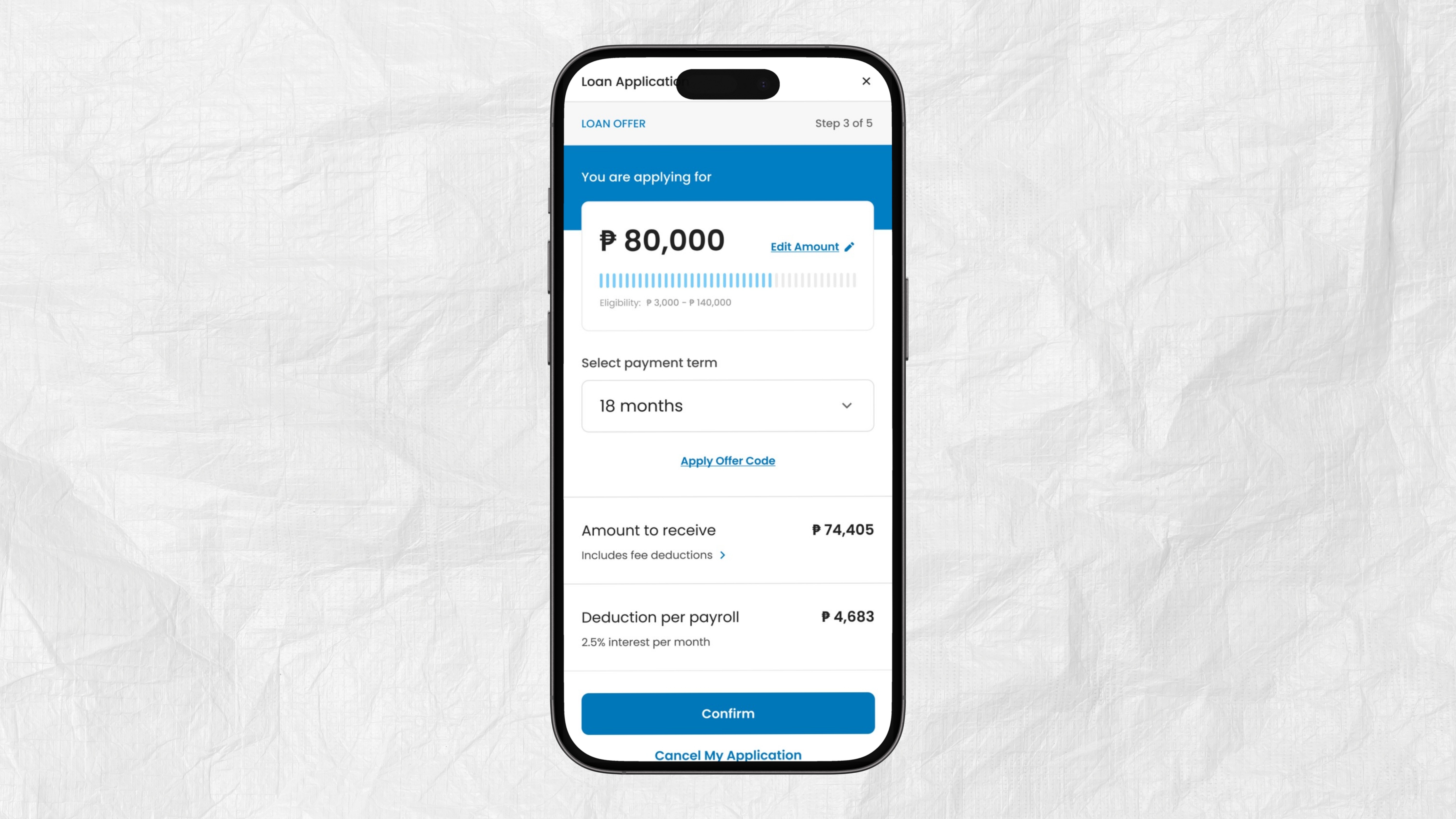
Monthly repayment and total repayable surfaced upfront, not disclosed on interaction
Loan amount adjustment made obviously interactive rather than passively displayed with a slider.
What moved into a bottom sheet: tenures, deductions, etc.
Reasoning we gave the client: The screen already let users change their loan amount. Nothing on it said so.
A blue bar sat where the control should have been, and users read it as a progress indicator, something reporting a status, not something they could move. The functionality wasn't missing. The affordance was.
So the argument wasn't that the page needed to look better. It was that users were dropping off at the exact moment they were meant to make a decision, because nothing on screen told them a decision was theirs to make.
We proposed three changes, each doing the same job: replace the bar with a real slider, with a visible handle and an obvious direction of travel. Increase the size of the amount itself so it reads as the primary object on the page. Place an edit icon directly beside it. Three separate signals that this number belongs to the user and can be changed.
Outcome: Drop-off on the loan offer page fell by around 15% after launch. More users adjusted the amount rather than accepting the default, and support tickets about changing loan amounts dropped noticeably.
Before

After
Restructure 02
Bottom navigation and the profile page it forced
The app had no bottom navigation bar. Four years ago that was a defensible choice. It isn't any more.
Adding it took repeated back-and-forth. The client's position was reasonable, navigation is a structural change, it touches everything, and it invalidates patterns users already know. Our argument was that the existing model was costing users more than the change would.
The knock-on effect: introducing bottom navigation forced the profile page to be rebuilt. It held a lot of information (account details, loan history, documents, settings) with no organising logic. Everything was equally visible, which meant nothing was findable.
What I did: Restructured profile into clear sections with top-level tabs, a pattern the app didn't use anywhere else. Anything a user might need to fill in or edit was grouped together, so updating your details became one place to go rather than a hunt across the app.
The more consequential addition was self-declaration.
SAVii repayments come out of payroll. If a user leaves their employer, the repayment mechanism breaks and that's one of the main ways people end up in recovery in the first place. So the product needed to hear about a job change before it happened, not after.
The existing mechanism couldn't do that. It was either a bottom sheet that appeared occasionally on the system's schedule, or it was inferred, a user editing their company name was read as a signal they'd switched jobs. Both put the burden in the wrong place. One interrupted people at a moment they weren't thinking about it. The other asked the product to guess at a critical event from an incidental edit.
We replaced both with a card in profile: if you're leaving or planning to leave your employer, declare it here. Visible, permanent, and available at the moment the user actually knows, which is usually long before the system would have found out.
Reasoning we gave the client: The same argument we made for recovery: let people find things themselves by grouping related actions together, rather than scattering them across the app. Fewer places to look means fewer support tickets from users who couldn't find one.
The self-declaration card carried a second argument. Every user who declares a job change early is a user who doesn't silently default when payroll deductions stop. Catching that in profile is cheaper than recovering it later.

Before

After
Restructure 03
Notification centre
The product sent push notifications and stored none of them. If you missed one, it was gone.
For a lending product this matters more than it does elsewhere. The information users miss is the information that costs them money, a payment falling due, a payment missed, entering recovery. A push notification is a moment. A repayment obligation is a state.
What we argued: users need a persistent place to check where they stand, not a stream of alerts they may or may not have seen.
What we built: Two axes, not one.
The first was category: repayments, application status, app updates, maintenance, promotions. That gave users somewhere to look for a specific thing rather than scrolling one undifferentiated feed.
The second mattered more. Anything requiring action pinned to the top with a red action-required marker, regardless of when it arrived. In a lending product, chronology is the wrong primary sort. A promotional message from this morning is not more important than a payment falling due tomorrow. Recency tells you when something happened; users need to know what happens next.
Reasoning we gave the client: Three arguments, one of them commercial.
On repayments: knowing a deduction is coming lets people plan around it. A user who knows what's leaving their salary and when is far less likely to be caught short and far less likely to end up in recovery.
On application status: everything about an application in one place, rather than reconstructed from alerts a user may or may not have seen.
On the business: a notification centre is a permanent, owned surface for announcing new features and products. A push notification gets one moment to land. A notification centre gives the same message somewhere to sit until it's read.

Before

After
04 Recovery
Recovery: the process nobody could explain
This one started as a complaint, not a brief.
The client's position was blunt: most people who enter recovery never pay anything back. That money was written off internally. It wasn't framed as a design problem. It was framed as a fact.
We took it on anyway.
what we understood
First we found out nobody knew how it worked
The first thing we tried to do was understand the existing recovery process. We couldn't. Not from documentation, not from the product team, not from people who had been at the company four years. Nobody could give us a complete account of what actually happens when a user enters recovery.
That's not a criticism of the client. It's what happens to a process that grew operationally over years without ever being designed.
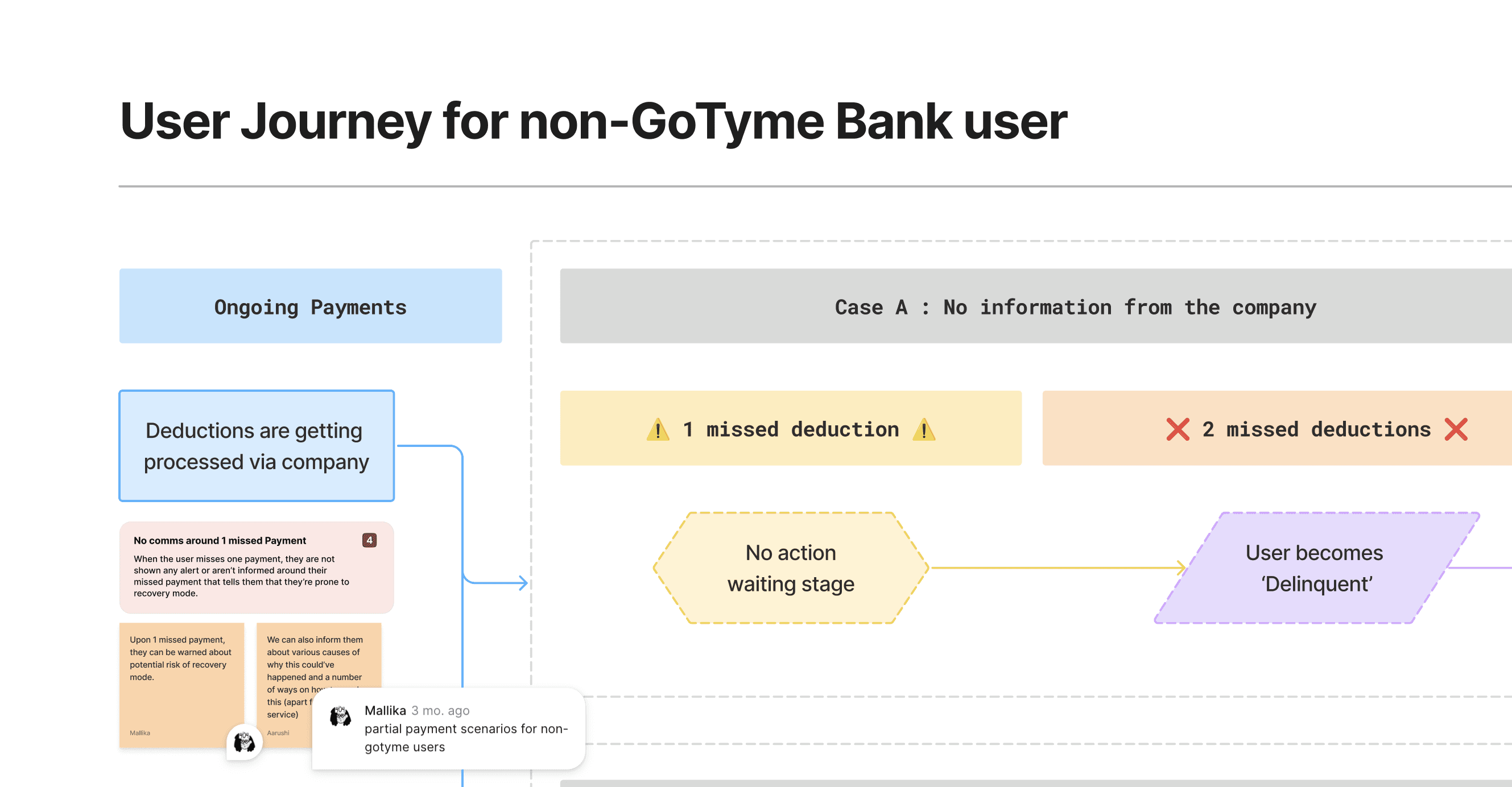
So we mapped what we thought it was and got it wrong.
We reconstructed the recovery flow as best we understood it, then took it to the team that actually runs recovery for a two-hour session.

The real problem
We were wrong about nearly all of it.
That session changed the project. The recovery team walked us through what genuinely happens at each stage, what they're legally permitted to communicate to a user, what they aren't, and where the real friction sits. Everything useful in the eventual design came out of that conversation and none of it would have surfaced if we'd kept working from the version we'd assumed was correct.
The lesson worth stating: we found the real problem by being confidently wrong in front of the people who knew better.
Presenting a flawed map got us corrections we'd never have got by asking open questions.
Then we scoped it down
The full picture was larger than one engagement. Fixing everything wasn't available.
So we prioritised deliberately: what could ship soon, and would recover money soon. We took the low-hanging fruit first, like a bottom-sheet that tells user they have entered recovery mode, instead of just putting there with little to no information, rather than holding out for a complete solution that would ship far later, if at all.
What exists now: a recovery experience that's genuinely streamlined and legible to a user who enters it, someone who is usually stressed, often confused about how they got there, and needs to know what to do next.
Status: built and yet to launch.

05 Constraints & Tradeoffs
What we couldn’t change, and what we gave up.
Constraint
Tradeoff
Legal limits on what recovery could disclose to a user.
Designed within what the recovery team confirmed was permissible, not what would have been clearest. Clarity had a hard ceiling here.
The client owned the roadmap. We didn't.
Spent design time building the case for structural changes, bottom navigation, notification centre, rather than on further exploration.
Four years of learned behaviour in an existing user base.
Accepted short-term disruption from a new navigation model in exchange for long-term findability.
Recovery was larger than the engagement could hold.
Shipped the pieces that could land soonest over a complete solution that would arrive far later.
Strict lending-compliance copy requirements.
Kept mandated language in full, and restructured hierarchy so plain-language summaries came first.
The most significant tradeoff was in recovery. We could have held out for a full redesign of the process, and it would have been the better product. Instead we shipped the pieces that could land soonest and start recovering money, because an incomplete solution that exists is worth more than a complete one still being scoped.
06 Outcome, impact & Next Steps
What I'd carry forward
Get to the real problem earlier.
Every one of these projects improved the moment we stopped accepting the stated brief. I'd now push for that in week one rather than arriving at it through friction.
Being wrong in public is faster than being careful in private.
The recovery mapping session is the clearest thing I learned on this project. A confidently wrong artefact got better information than any number of open questions would have.
15%
Drop-off reduction on
loan offer page
03+
Core flows restructured
20%
Reduction in loan-amount
support tickets


