Kraft
Overview
Kraft is an e-commerce brand specialising in premium kitchenware such as cast iron and stainless steel cookware.
The goal was to design a modern, intuitive website that highlighted the brand’s craftsmanship while making the buying experience seamless and visually consistent.
I was responsible for the UX/UI design, ensuring a strong foundation built on both usability and aesthetic precision.
Key Responsibilities
Research
Before starting the design, I conducted a brief competitive analysis of leading cookware and home-living brands.
The research revealed that while most websites focused on showcasing products, they lacked a sense of brand storytelling and emotional connection
To differentiate Kraft, our approach was to create a narrative-driven e-commerce experience, one that blended clean, functional layouts with visual warmth, inviting users to explore rather than just shop.
Goal
a Shopify-ready e-commerce site with a clean and timeless look.

Scope
16-17 unique pages, responsive for desktop and mobile.

Timeline
~1.5 months.
Define Phase
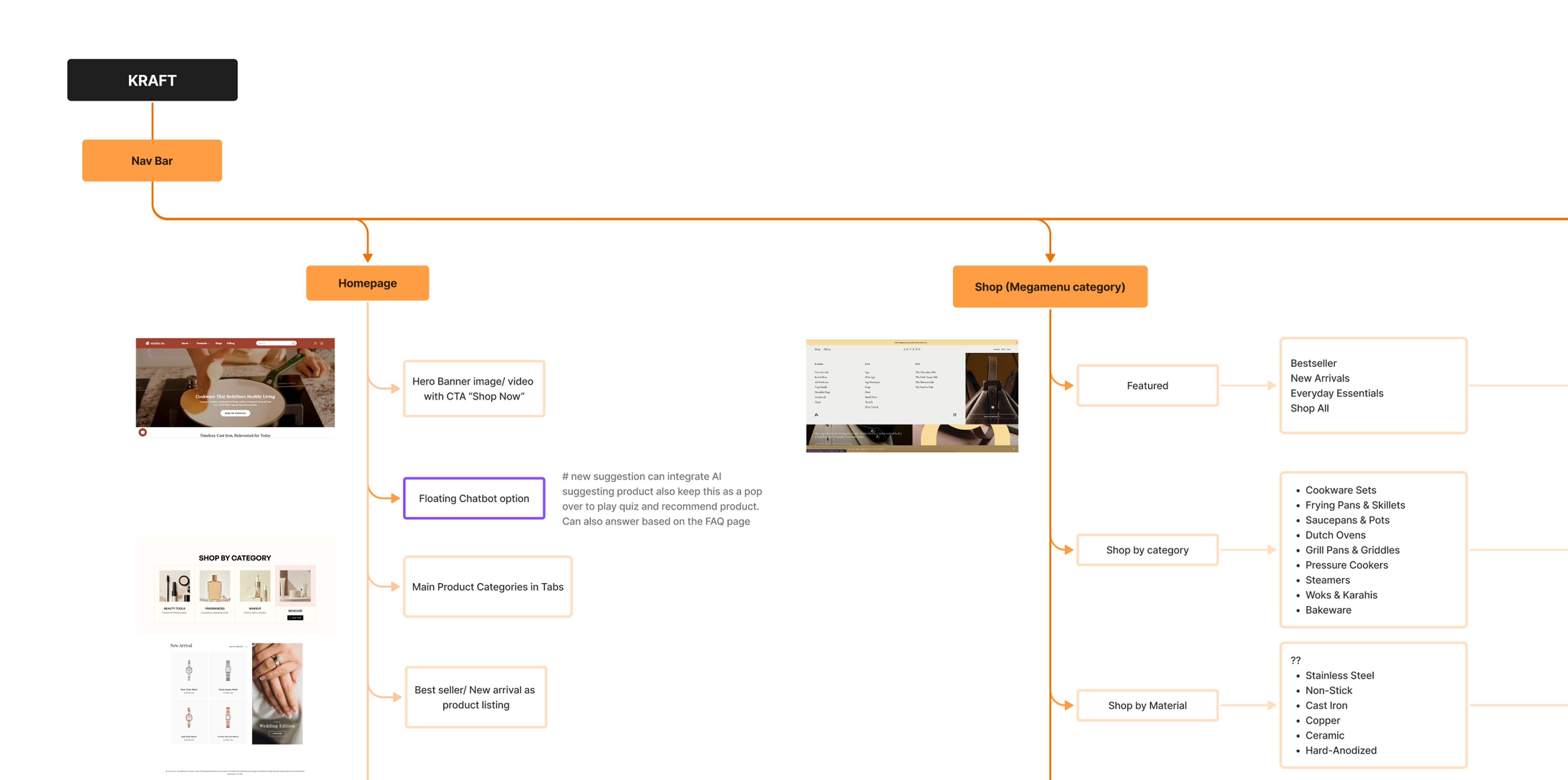
In the Define phase, I worked on two key foundations: Information Architecture and the Design System.
Information Architecture
We mapped out clear navigation flows to help users move intuitively from homepage to checkout. The structure balanced storytelling and usability, ensuring that sections like “Set Up Your Kitchen” or “What Sets Us Apart” felt natural and easy to reach.
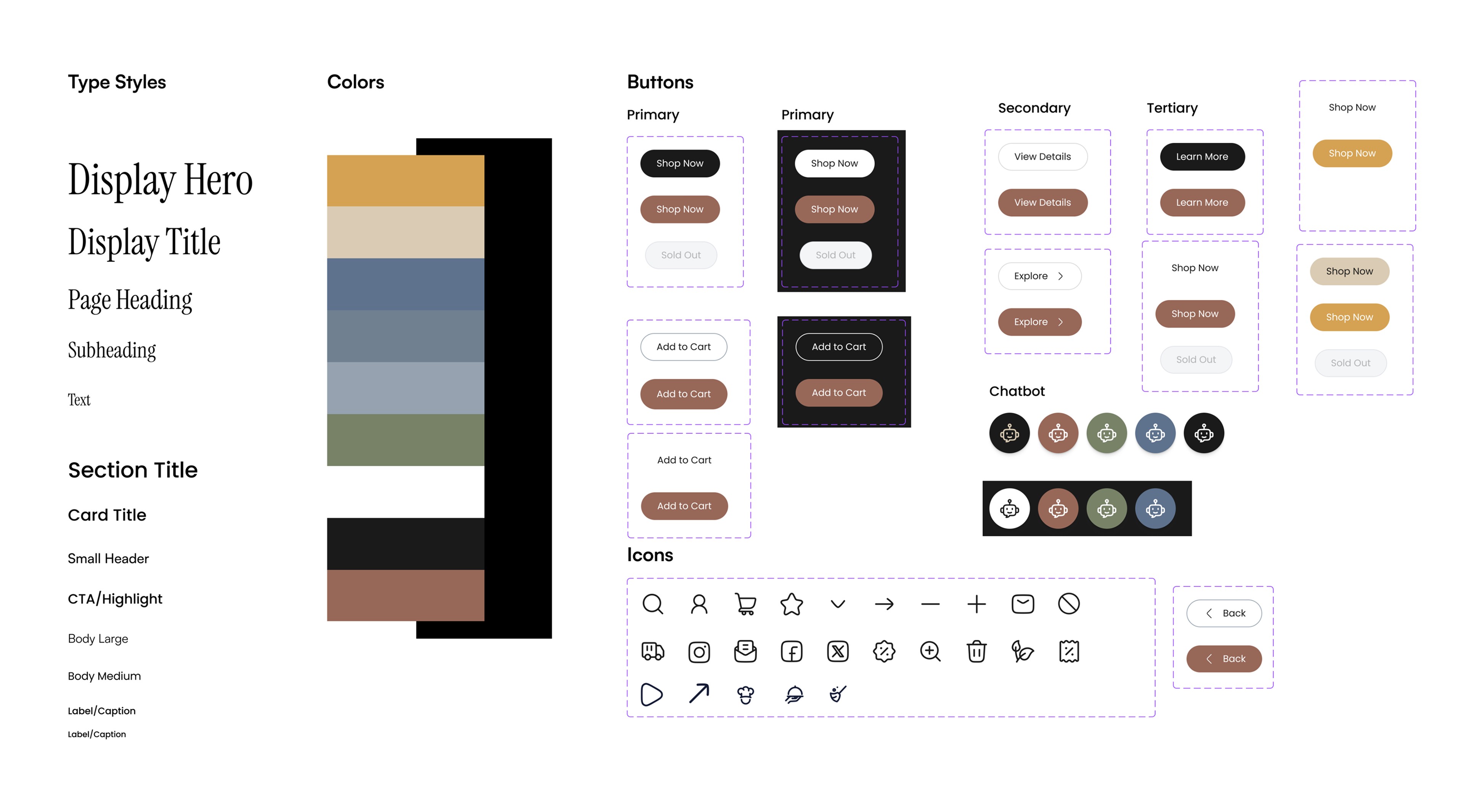
Design System
Parallelly, I built a scalable design system in Figma that defined Kraft’s visual and interaction guidelines.
This included:
Typography: Instrument Serif for headers, lending an elegant, timeless look, and Poppins for body text, offering readability and modern balance.
Color Palette: A blend of green, brown, and off-white, inspired by earthy materials and the idea of natural craftsmanship.
UI Components: Buttons, icons, hover states, and spacing tokens were standardized for consistency across all pages.
This phase laid the groundwork for maintaining visual coherence and brand identity throughout the site.
Ideation
The ideation stage focused on conceptualizing the look and feel of the website.
The visual theme revolved around calm minimalism with an artisanal warmth, echoing Kraft’s handcrafted products.
We structured key homepage sections around storytelling:
Hero Section: Introducing Kraft’s essence and mission.
Categories & Bestsellers: Encouraging quick discovery.
What Sets Us Apart: Highlighting brand differentiators.
Krafted for Gifting: Establishing an emotional connection.
Design Iteration
The design iteration phase for Kraft’s homepage was one of the most time-intensive yet rewarding parts of the project.
Our primary focus was to refine two crucial sections; the Hero Section and the Bestsellers Section, both of which had a significant impact on first impressions and conversions.
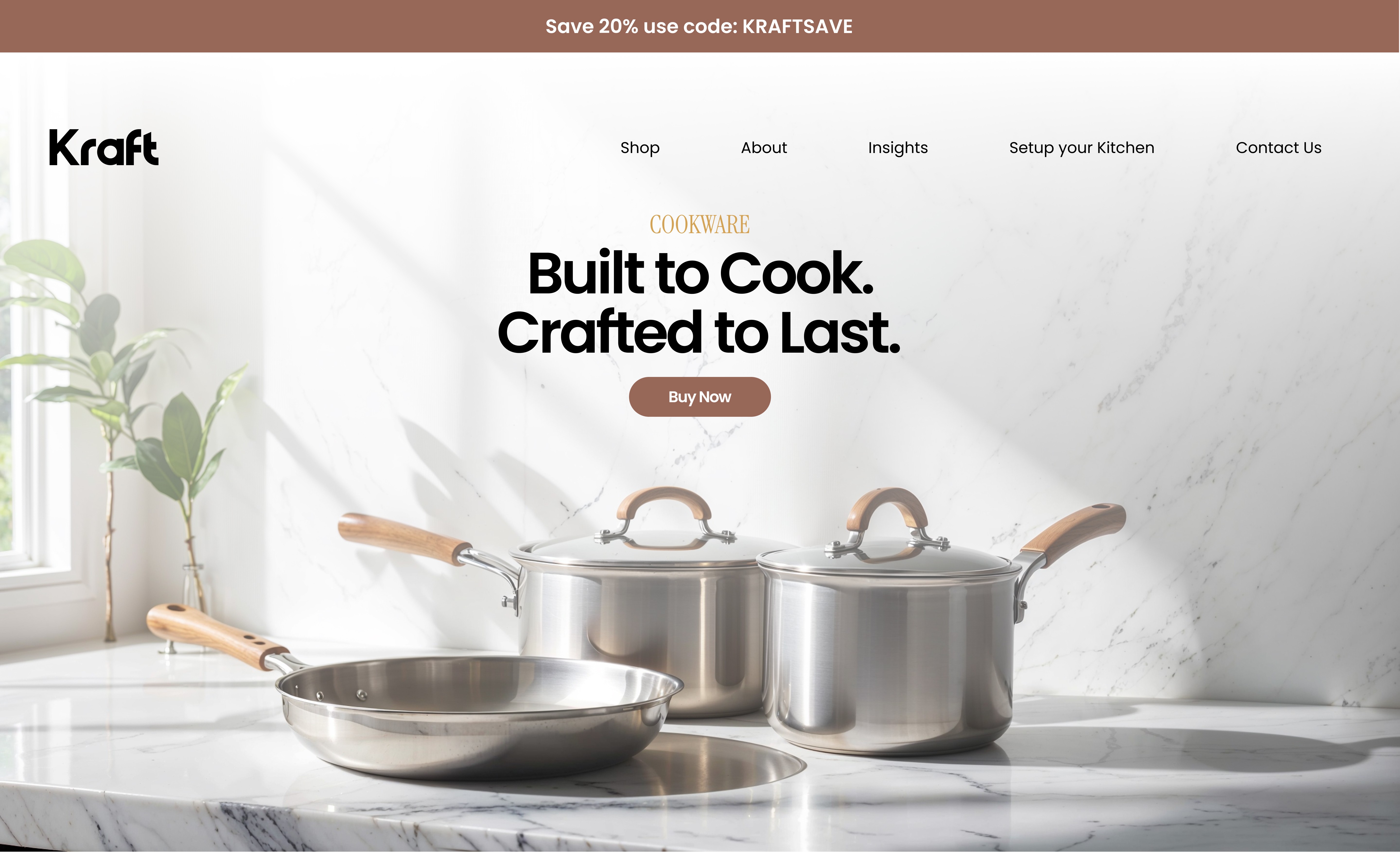
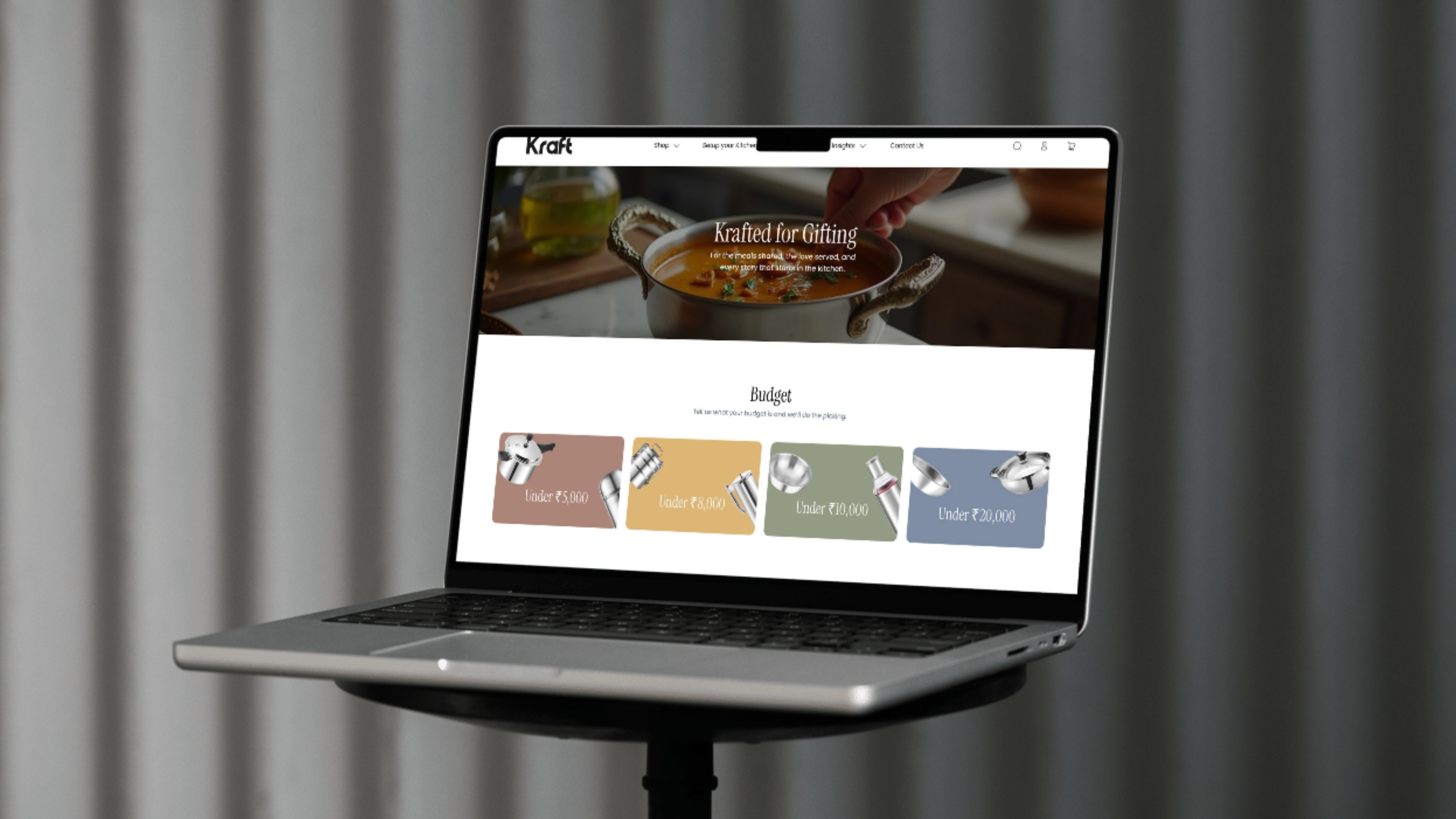
Hero Section: Finding the Right Visual Voice
The first version of the hero section featured a simple image of cookware with the tagline “Built to Cook, Krafted to Last.”
Initially, we explored a colour-coded approach, where:
Brown represented Cookware
Green represented Serve ware
This idea worked conceptually, as it created a clear visual distinction between categories.
However, once we realised that Kraft’s inventory extended beyond cookware and serve ware into storage solutions, this approach became restrictive. Including three distinct categories in a single hero layout made the interface cluttered and confusing.
In the final iteration, we shifted toward a more cohesive and inclusive design:
a neutral kitchen-top background with animated transitions showcasing different products from all categories: cookware, serve ware, and storage.
This subtly communicated that “no matter your cooking needs, Kraft has something for you.”
To complete the message, we added a new tagline:
“Krafted for Indian Kitchens.”
This connected the brand’s universal appeal with a localized identity, celebrating every Indian kitchen’s diversity.
The next challenge was the Bestseller section, which needed to showcase top products while maintaining Kraft’s elegant and minimal tone.
In the initial version, we included detailed product cards displaying:
Product image
Rating
Price
Add to cart
Wishlist
“Shop Now” button
Although informative, this layout felt too sales-oriented and visually dense, almost pushing the user to purchase rather than inviting exploration.
For the final iteration, we refined the layout with a subtle background in Kraft’s brown palette (at 5–10% opacity) and simplified the product cards to include:
Product image
Name
Starting price range
Small rating tag
Minimal wishlist icon
To keep the experience interactive yet calm, the “Add to Cart” button only appears on hover, signaling intent without being intrusive.
This gave the section a cleaner, more empathic tone, one that respects the user’s decision-making process while still driving engagement.
Prototype
The final prototype brought together all aspects, structure, storytelling, and simplicity.
Highlights included:
A minimal hero banner that communicated Kraft’s identity instantly.
Clear category navigation and product discovery.
A unique “Set Up Your Kitchen” quiz to personalize recommendations.
Responsive layouts for desktop and mobile.
The result was a visually consistent and experience-rich design ready for Shopify development.
Conclusion
If given more time, I would conduct usability testing and refine micro-interactions, such as hover transitions and subtle motion effects, to make the experience more immersive.
Additionally, integrating personalised recommendations or “Shop the Look” modules could further enhance engagement.
This project strengthened my ability to merge UX clarity with brand storytelling, creating a scalable design system that’s both functional and emotionally resonant.