HiBOSS
Overview
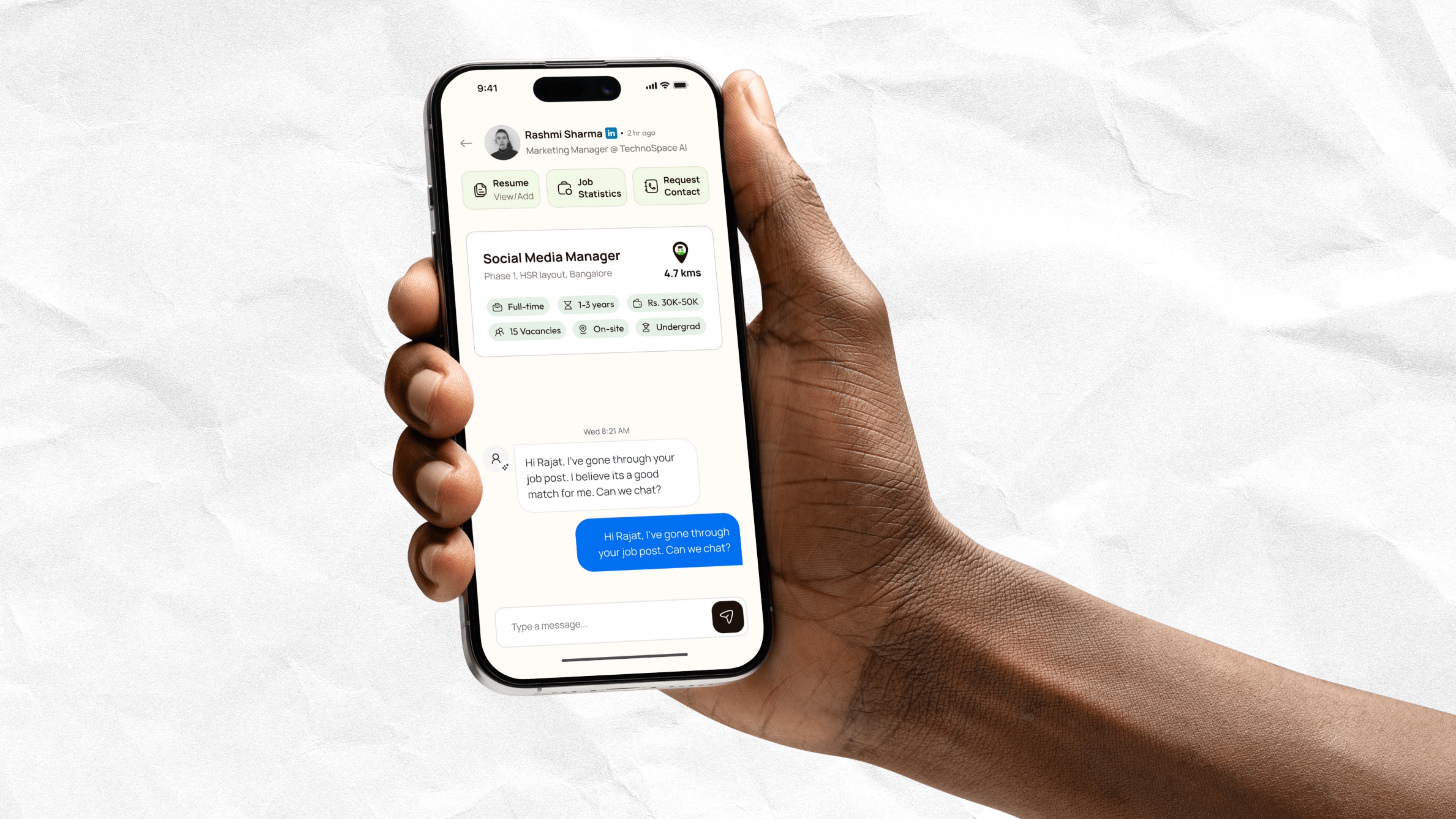
HiBoss is a global job search and hiring app that connects job seekers directly with their next boss nearby. Designed for Gen Z and SMBs, the platform eliminates the delays and inefficiencies of traditional hiring by enabling direct chat-based communication and instant responses.
As the UI/UX Designer, I was responsible for designing the complete app interface, creating the visual identity, and ensuring a seamless experience for both job seekers and employers, all within a tight three-week timeline.
Key Responsibilities
Research
We began by studying existing job search platforms like LinkedIn, Indeed, and Naukri, to understand their strengths and the friction points users typically face.
Our goal was to create something faster, more conversational, and locally relevant — with features that supported instant hiring decisions and privacy control.
We identified that Gen Z job seekers value speed, personalization, and transparency, which became the foundation of HiBoss’s design direction.
Define Phase
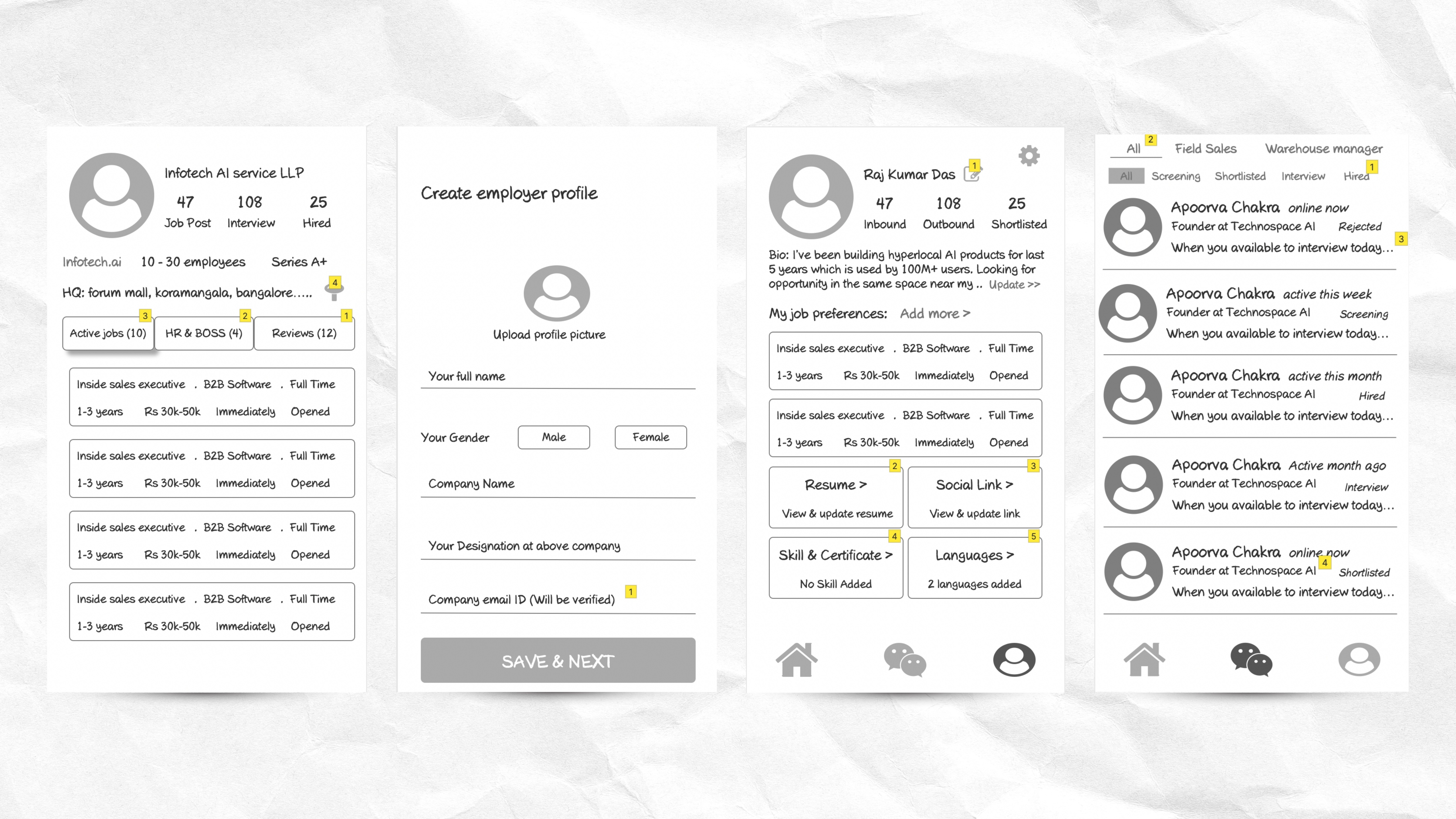
Wireframes
In this phase, I worked on two core aspects, Wireframes and the Brand Identity.
We mapped user flows for both employer and job seeker journeys, ensuring the structure supported dual roles efficiently.
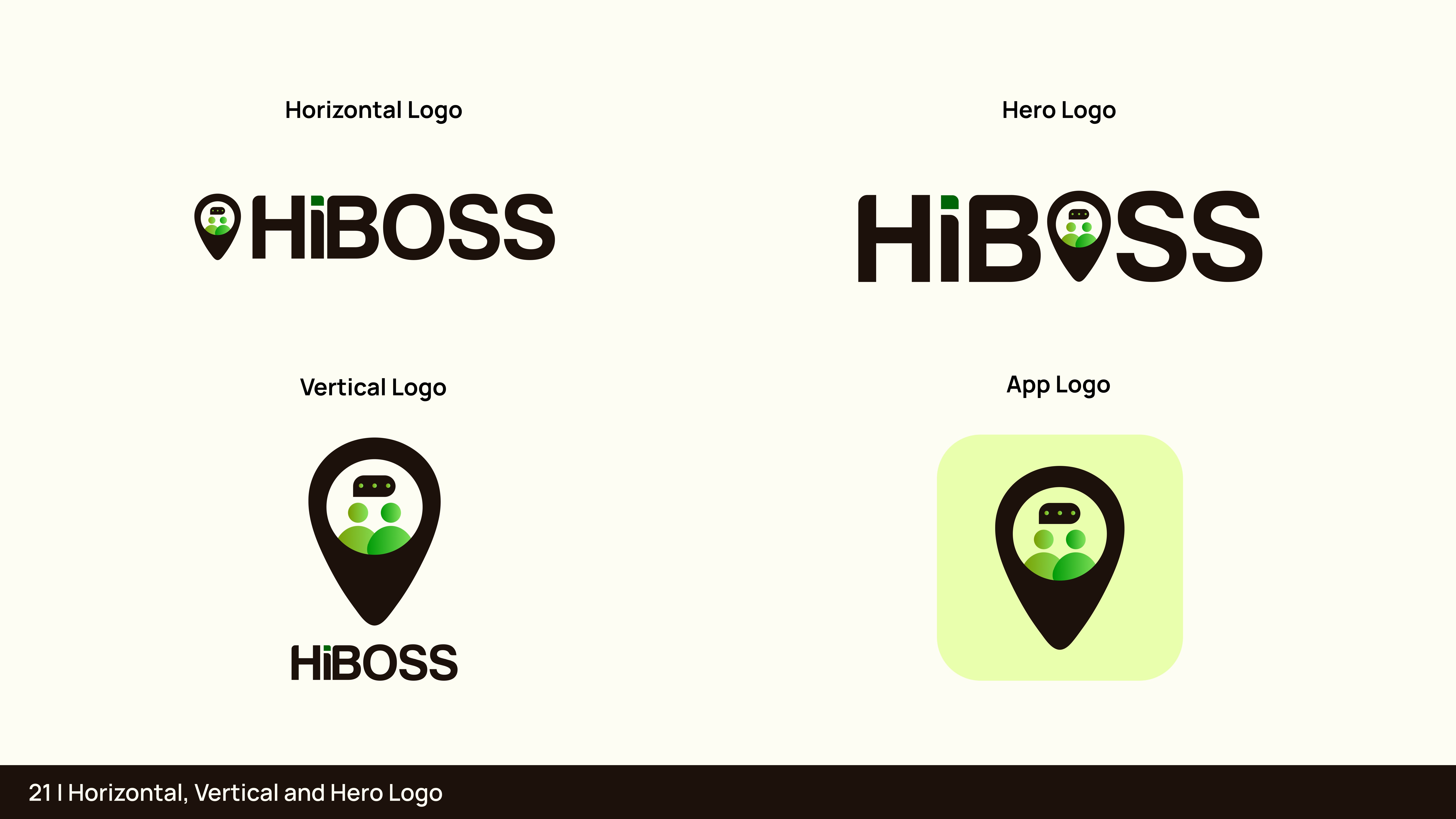
Brand Identity
I also defined the brand system from scratch, creating the logo, color palette, and typography.
The visual direction uses a vibrant yet professional palette, reflecting energy and modernity, while keeping the interface clean and easy to navigate.
Ideation
Once the structure and visual foundations were clear, I explored how we could make HiBoss instantly recognisable to its Gen-Z audience.
We finalised a colour theme that blended energetic greens with clean neutrals, maintaining a balance between boldness and trust.
The design language emphasised clarity, conversational tone, and action-driven layouts that motivate users to connect quickly.
Design Iteration
Since this was a fast-paced project, our iteration rounds were short but focused.
Most screens were approved in the first or second review, with minor adjustments to spacing, contrast, and visual hierarchy.
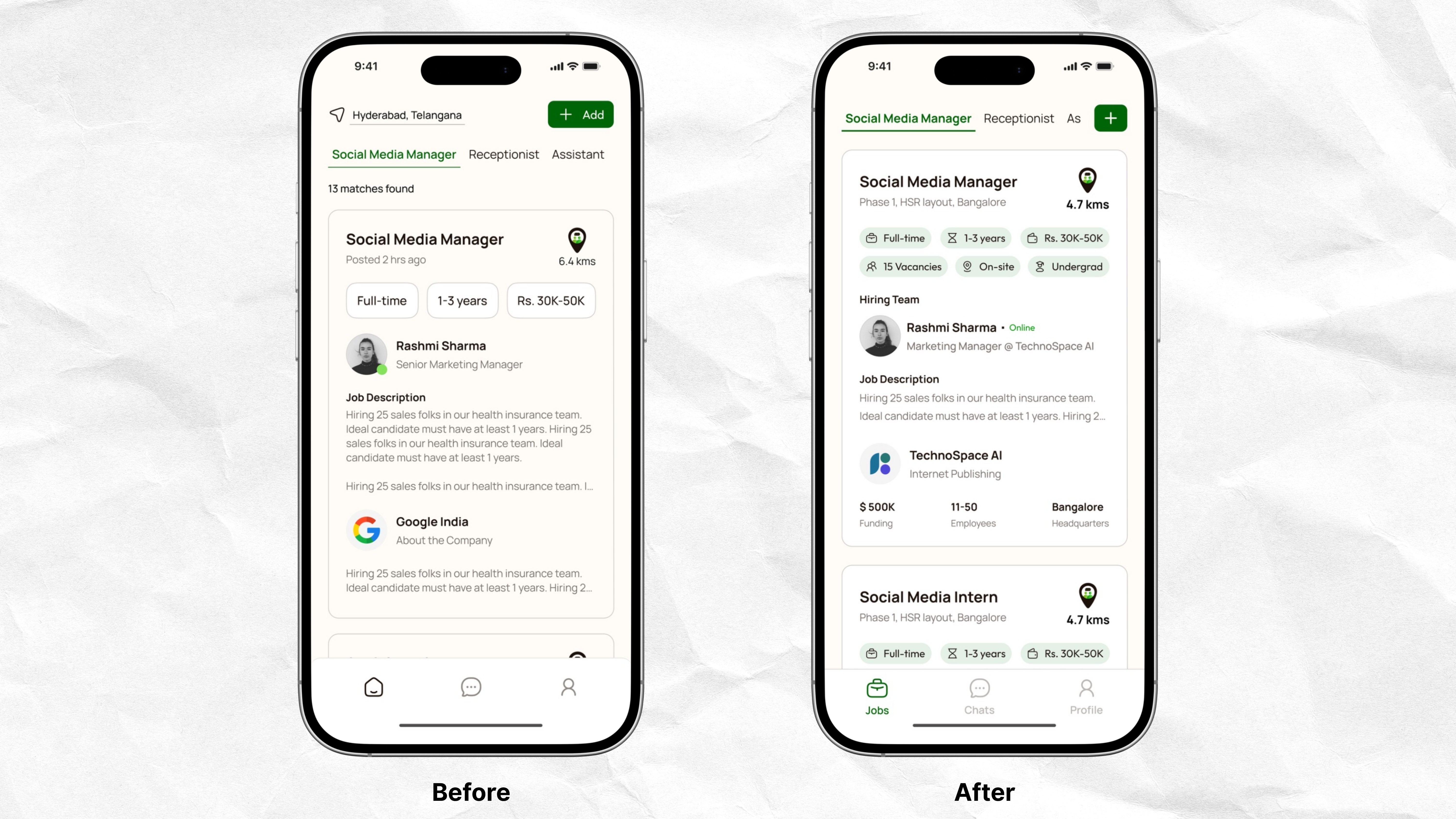
The homepage posed the biggest design challenge, balancing similar structures for both job seekers and employers while keeping it clear which side the user was on.
We experimented with subtle layout and colour cues before finalising a design that worked seamlessly for both.
Prototype
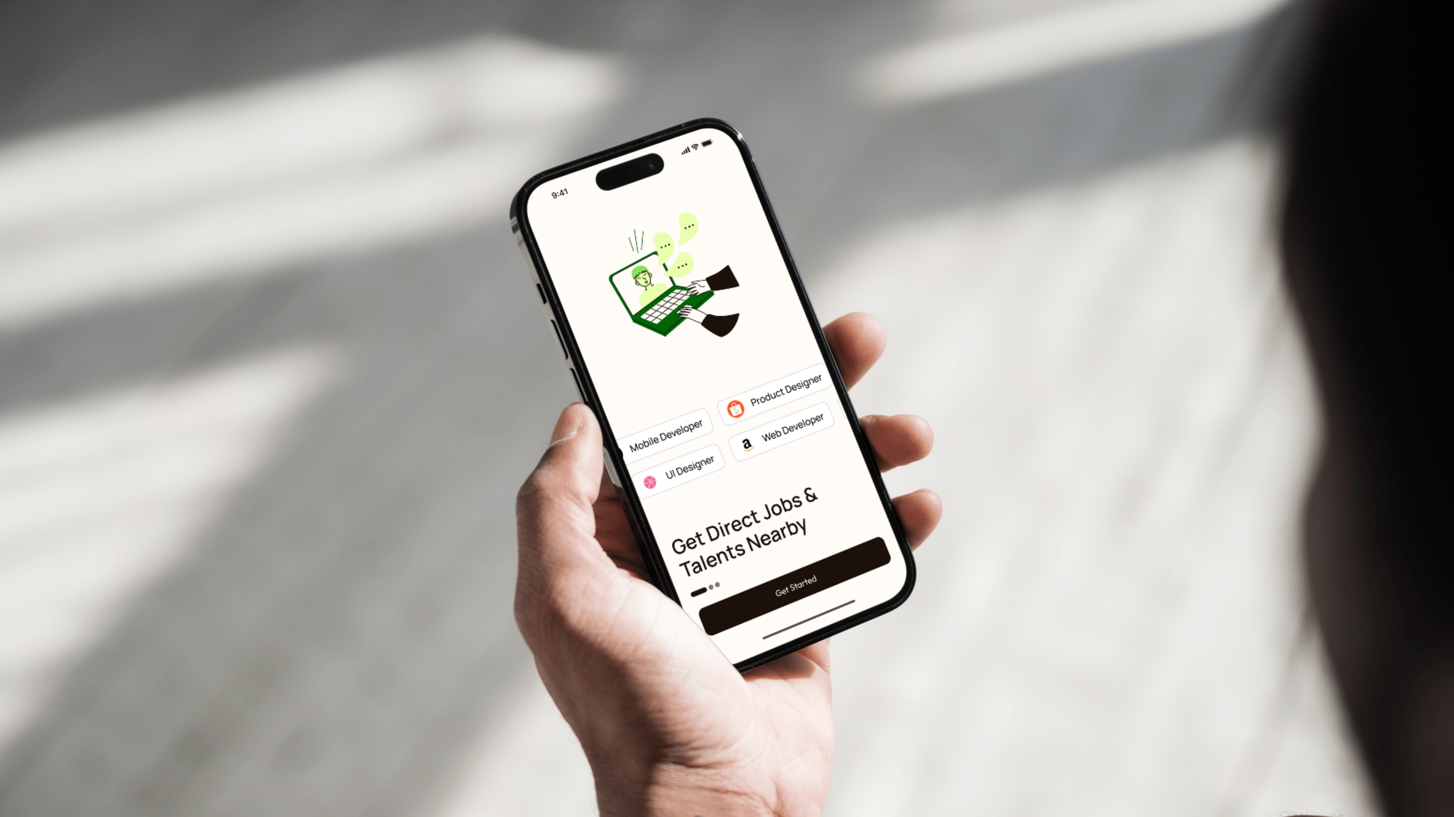
The final prototype delivered a cohesive, end-to-end experience.
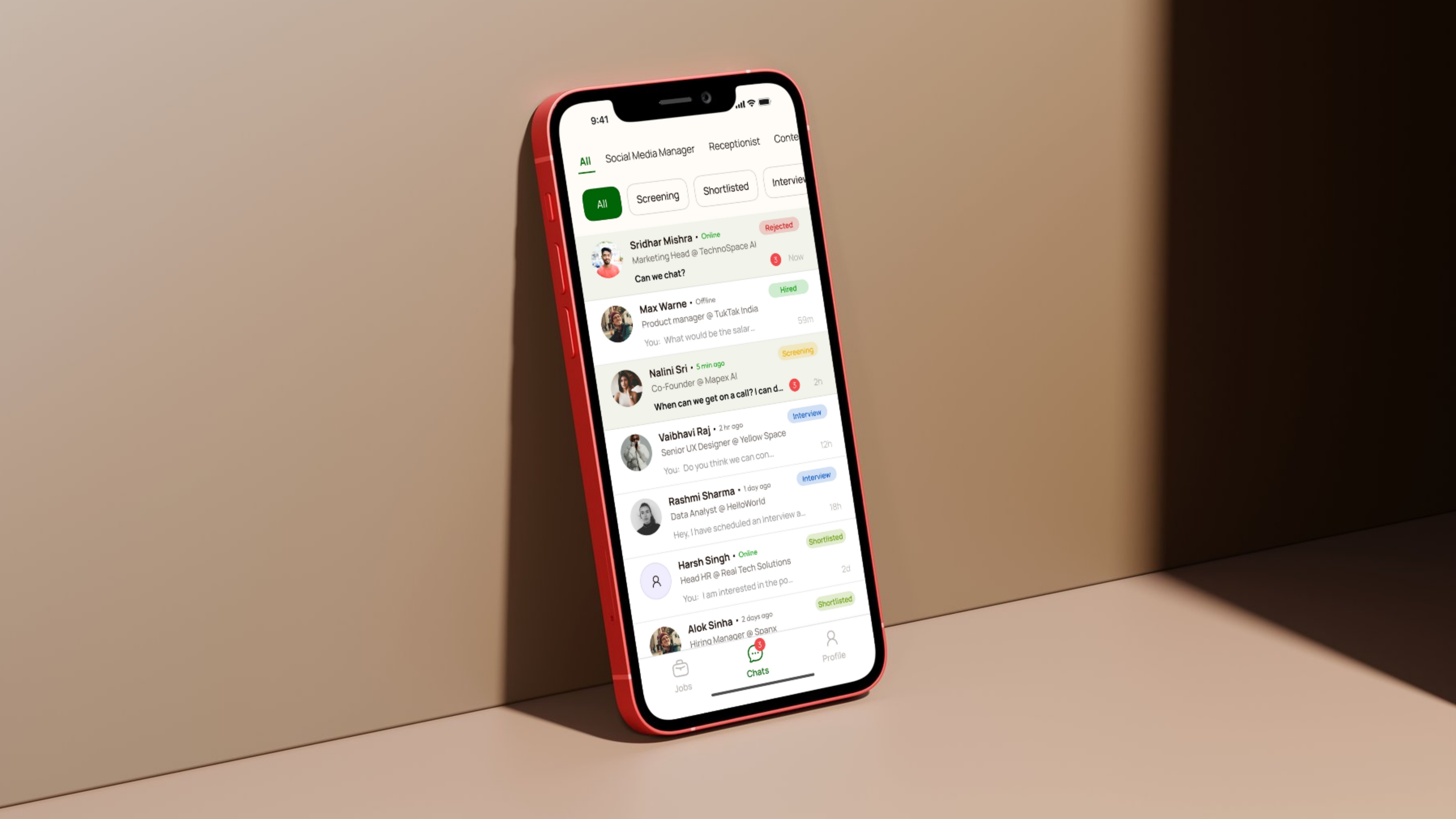
It allowed users to set job preferences, explore nearby opportunities, chat directly with active employers, and manage their profiles with minimal effort.
Employers could shortlist and interview candidates instantly, all from one screen.
The interface was responsive, accessible, and consistent with the brand’s vibrant yet minimal aesthetic.
Conclusion
HiBoss proved to be one of my most efficient full-app design projects, completed within four weeks with minimal revisions.
If given more time, I’d like to refine the onboarding flow, reducing the number of questions asked upfront and instead gathering user preferences gradually as they explore the app.
This would help minimise drop-offs and improve user retention.
Overall, HiBoss successfully brought the idea of instant, direct, and personalised hiring to life, designed for the pace and expectations of the modern workforce.
Next Steps
The HiBoss app is currently live and launched.
Once enough users are onboarded, we plan to conduct usability research to identify real-world pain points and behavior patterns.
Based on these insights, we’ll continue refining the design — improving onboarding, enhancing accessibility, and optimizing interaction flows to create an even more seamless user experience.